

In today’s digital age, a responsive website isn’t just a luxury but a necessity. The rise of mobile devices has transformed the way we access the internet, and a website’s responsiveness to various screen sizes is a fundamental aspect of user experience. If you currently have a static HTML website and wish to make it dynamic and responsive, you’re on the right path. In this article, we’ll guide you through the process of converting an HTML site into a responsive WordPress site. Additionally, we’ll touch upon the conversion of a Drupal site to WordPress. We’ll emphasize the importance of responsiveness, offer key insights on achieving this transition effectively, and discuss the role of responsive design in contemporary web development.
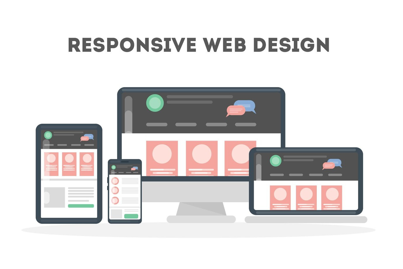
Why Responsive Design Matters
The Mobile-First Era
We’re living in a mobile-first era. Smartphones and tablets are the go-to devices for accessing information, shopping, and communication. More users are accessing websites on mobile devices than ever before. A responsive website ensures that your content looks and functions seamlessly on screens of all sizes, from the smallest smartphone to the largest desktop monitor.
SEO Benefits
Search engines, led by Google, have recognized the significance of mobile-friendly websites. They’ve incorporated mobile-friendliness as a ranking factor. This means that responsive websites tend to rank higher in search results, which can significantly impact your website’s visibility and reach. A responsive design isn’t just about aesthetics; it directly affects your website’s performance on search engine results pages (SERPs).
Enhanced User Experience
A responsive website doesn’t just cater to search engine algorithms; it caters to the most critical aspect of your online presence – your audience. It provides a superior user experience. Responsiveness leads to longer visits, lower bounce rates, and higher conversion rates. When users can easily navigate and interact with your site, they are more likely to stay engaged and take the desired actions.
Converting HTML to a Responsive WordPress Site
Planning the Transition
Before you dive into the conversion process, it’s essential to develop a clear plan for HTML to WordPress responsive design. Identify the key pages and content you want to retain. Consider the site’s structure and layout. A clear plan will save you time and help you avoid potential pitfalls.
Choose a Responsive WordPress Theme
One of the advantages of using WordPress is the vast selection of themes available. When converting your HTML site, select a WordPress theme that’s responsive “out of the box.” Responsive themes are designed to adapt to various screen sizes automatically. This choice will save you time and effort, as you won’t need to fine-tune the theme for responsiveness.
Install WordPress
Once you’ve chosen a responsive theme, it’s time to set up a WordPress environment. Install WordPress on your hosting server or use a local development environment if you prefer. Make sure that the version of WordPress you’re using is compatible with your selected theme.
Content Migration
This is a crucial step that may require technical expertise. You’ll need to migrate your HTML content to WordPress. This includes transferring pages, posts, images, and other media files. Pay close attention to formatting to ensure consistency. Additionally, be sure to migrate any scripts or custom code used in your HTML site.
Testing
Testing is a pivotal phase in the conversion process. Test your website on various devices, including smartphones, tablets, laptops, and desktop computers. Ensure that your site adapts well to different screen sizes. Pay attention to details like fonts, images, and navigation menus. Make necessary adjustments to fix any responsiveness issues you encounter during this testing phase.
Plugins for Responsiveness
Consider using responsive design plugins to fine-tune your site’s responsiveness. These plugins can help you optimize your site for various screen sizes. Popular options include:
WPtouch: This plugin adds a mobile-friendly and responsive theme to your site.
WP Mobile Menu: It allows you to create a responsive mobile menu for your WordPress site.
Using these plugins, you can further enhance the responsiveness of your site and ensure that it provides an optimal experience across all devices.
Converting a Drupal Site to WordPress
Converting a Drupal site to WordPress shares many similarities with the HTML to WordPress conversion process, but there are some specific considerations:
Content Backup
As with the HTML to WordPress conversion, start by creating a backup of all your Drupal site’s content. This includes articles, images, documents, and any other data you wish to retain.
Exporting Data
Use the WordPress Drupal Migrate module to export your content from Drupal. This module simplifies the migration process and makes it more efficient. It can export data like nodes, taxonomy terms, users, and comments.
Import to WordPress
After exporting your Drupal content, you can install the Drupal Migrate module on your WordPress site. Use this module to import the Drupal content into your new WordPress site. During this process, you may need to adjust formatting, structure, and content organization to ensure it aligns with your chosen WordPress theme.
Theme Selection
Just as with the HTML conversion, you’ll need to select a responsive theme for your WordPress site. Ensure that the theme aligns with your design preferences and the type of content you plan to feature.
Testing and Optimization
After migrating your Drupal content and setting up your WordPress theme, conduct extensive testing. Verify that your site is responsive and adaptable to various devices and screen sizes. Make adjustments as needed to guarantee a seamless user experience.
Conclusion
Responsive design is not a mere buzzword; it’s a fundamental aspect of web development. In a world where users access websites through a multitude of devices, your website’s adaptability is a crucial factor in its success. Whether you’re converting an HTML site or a Drupal site to WordPress, embracing responsive design is the key to delivering an exceptional user experience and enhancing your website’s performance.
Making the transition from HTML to a responsive WordPress site or from Drupal to WordPress is a strategic move that can significantly improve your website’s accessibility and performance. In today’s mobile-first world, responsiveness is vital. By following the steps outlined in this article and using responsive design plugins where appropriate, you can ensure a seamless transition. Remember that the benefits go beyond aesthetics – a responsive website enhances user experience, aids SEO efforts, and ultimately sets your website up for success.
FAQs
What is responsive web design?
Responsive web design is an approach that ensures a website adapts seamlessly to various devices and screen sizes, providing an optimal user experience.
Why is responsive design important for SEO?
Responsive design is important for SEO because it improves your website’s mobile-friendliness, which search engines favour in their ranking algorithms.
Can I convert an HTML site to WordPress without losing content?
Yes, it’s possible to convert an HTML site to WordPress while retaining all your content. Proper planning and execution are crucial.
What are some responsive design plugins for WordPress?
Popular responsive design plugins for WordPress include WPtouch, WP Mobile Menu, and Jetpack by WordPress.com.
How long does it take to convert a website to a responsive WordPress site?
The time required for the conversion depends on the complexity of the website and the extent of customization needed. Typically, the process can be completed in a few days to a week.